What do you think?
The Scheme

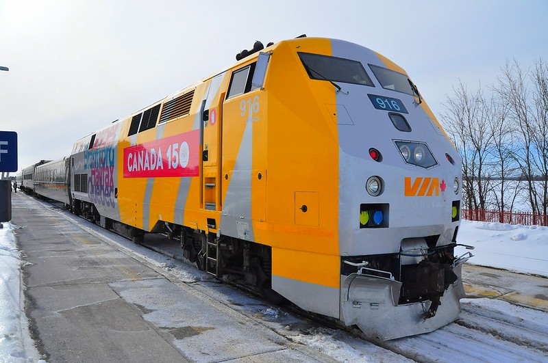
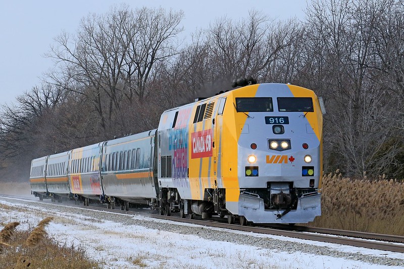
Our great country is turning 150 years young this year. The federal government has many plans for celebrating this birthday and one of those is for VIA Rail to decorate many of its locomotives and passenger cars. So far several P42 locomotives have been wrapped and one F40PH-2 (VIA 6454), as well as some LRC passenger cars.

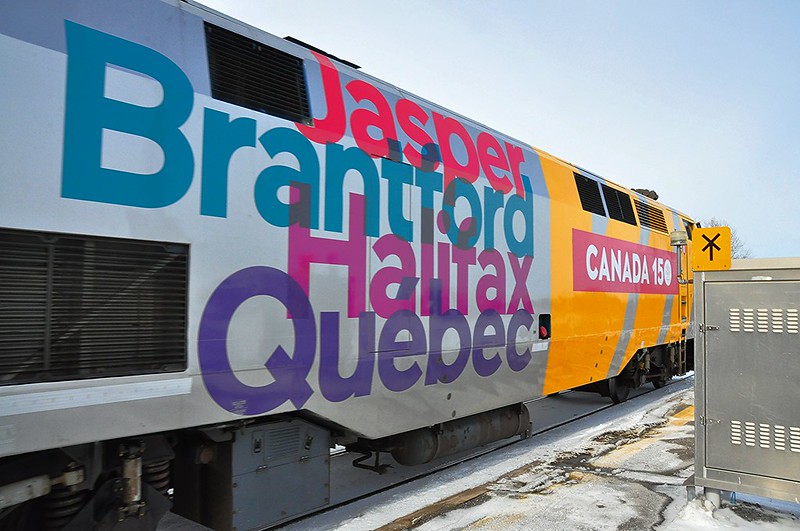
The wraps feature a giant yellow VIA on the head end with "CANADA 150" on a red rectangle, and four city names on the rear - with different cities on each side.
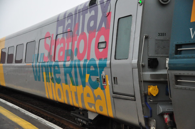
The passenger cars have a similar wrap.
Note that some cities are duplicated across units or cars.
Here's VIA 3351 wrapped, featuring "Halifax", "Stratford", "White River" and "Montreal".

There are some subtle differences between cars, beyond the names on the sides. Some early cars and locomotives had white numbers but apparently they are now using black numbers, which stand out better. Also later locomotive pilots and underframes seem to be being painted black instead of silver.
 |
| VIA 6454 at Berry Mills, New Brunswick - photo by Matt Landry |
Here's a video showing VIA 6454 near Moncton.
Eric Gagnon has been keeping track on his blog. I don't want to try to duplicate his efforts. I want to go meta and comment on the commentary swirling around the railfan forums.
How Do You Feel?
I'd say that the majority of railfans either dislike it or really, really HATE it.
The Haters
A few people question the actual design:Where are the Canadian flags or the Union Jack, as we are celebrating Canada's 150 years?Or:
The scheme design would appeal to me a lot more if instead of that *CANADA 150* banner down the flank it simply had the 1867-2017 maple leaf symbol in its place.Some people really, really, really don't like it.
it would insult a circus if I suggested that it looks like a circus train. Mickey Mouse would have been kicked out of Disney Land if he ever designed such a crappy paint job.....or "Wrap-job". Via Rail I thought was trying to be a "Class Act", but this wrap job is plain and simple "GARBAGE"Tell us how you really feel! ;)
The Likers
Some people do like it.Personally, I think it does exactly what VIA wanted it to do. It's bright, bold, and indisputably eye-catching.Some are picking the lesser of two evils:
Good job by VIA wrapping the LRC cars. The more they cover the ugly teal green the better!
Nice to see something other than the Ren scheme!
Nicknames
Some railfans have taken to calling the scheme the "silver banana"... which I guess is better than the railfan nickname for the Loto Quebec unit VIA 6414.I think Eric Gagnon is trying to champion "Roll Up The Wrap To Win" combining the wrap with Tim Hortons' famous contest. Good luck with that.
 |
| You win! Or do you? |
My Comments
I'm very surprised by the hate being levied against VIA Rail and this wrap.Railfans love something different, whether it is an Illinois Central unit still in "death star" black, or VIA's Glenfraser car vs. a normal VIA LRC car, so why wouldn't you like to see some cars and locomotives in a different scheme? Most people liked it when VIA wrapped the F40s with the Telus or CBC wraps, for example, although nobody liked "the Turd" / Loto Quebec.
 |
| I always liked the Operation Lifesaver unit |
To that I say, be thankful that VIA did anything at all. VIA Rail has a very hit or miss record of commemorating Canadian milestones. They did commemorate Canada's veterans with the Veteran's Train and Canada's war brides the next year, but those were local initiatives. VIA completely ignored the 100th anniversary of the Ocean. Please correct me if I'm wrong, but I don't believe VIA doesn't have a good history of remembering history.
 |
| Double Spiderman 2! Is that Spiderman 4? |
We're people who sit trackside and photograph trains. We have no influence, nor should we. We're lucky that we live in countries where we A) can photograph trains without being harassed or arrested, and B) have the time and money to be able to enjoy our hobby. Sheesh.
If railfans had designed it, "VIA" would be in CP script, the car would be half maroon and half blue and yellow, with the British Union Jack superimposed over the Canadian flag, and every train would tow a replica of the Turbo. I'd try to Photoshop that hot mess together, but I can't bring myself to do it.
As my mother-in-law says, "it is what it is" so enjoy it or hate it while it's around. At least it's not the Turd.
 |
| At least it's not this |
Leave a comment - how do you feel about it?
11 comments:
I don't hate it, or love it...I agree some Canadian Flags or something would be nice. I hope they have more Western destinations represented besides 'Jasper'.
Hi Jenn, good to hear that someone is "in the middle" :)
They have Jasper, Saskatoon, Kamloops, Churchill, Winnipeg, and Gillam so far. I hope for a lot of other western cities and towns too.
This has to be a first - two of my blog partners appear in Trackside Treasure's sidebar with posts on the same topic, and mine too. CANADA 150.
There are two parts to this - the government's own choice for the commemmoration, then the way in which VIA approached it.
For a whole bunch of alternative designs, check out this page:
http://the150logo.ca/
I really like the stylized beaver and loon designs. Anyway, the Harper government made their choice.
Yes, VIA chose to do SOMETHING which is great. Whether they applied it in a way to suit every railfan (impossible) is another matter (better not to try, anyway).
This is an inate Canadian trait: we are independent and pedantic to the point that when someone else does something, we just sit around and complain about it. Seems that way in the railfan community in particular.
I do like the 'roll up the rim' nickname, Steve. It's not my suggestion. For some reason, the silvery look made me think of stainless steel. My suggestions included Silver Sesqui, Canfleet and Danielle Steel, the latter for no good reason! Others chipped in with characteristic Canadian comedic content, including "150 Years then This Happened".
I would also use the literary title term, "A Tale of Four Cities" based on the names applied.
It would be interesting to view the wraps through the lens of the genesis of the modern Canadian flag, and even the 1967 Centennial logo, which even made its way onto SWP grain elevators. There was much controversy about these, too.
All in all, we should choose to focus on this great country and the privilege we have to debate, to disagree, and to decal/wrap stuff at will!
Thanks for posting,
Eric
I agree with a lot of what Eric said before me here.
I think it is fantastic that VIA is doing something to celebrate things. They get points for trying for sure and I think trying and going for something with them is fantastic and should be promoted by railfans.
That said, I think they had an opportunity to do something iconic and fun but really didn't run with it. I look back at the 67 trains (I wasn't alive then or anywhere close to that point, but I appreciate looking back at it), what they represent, how cutting edge and modern they were and how they paid homage to the past and did it in a simple, classy way. Same goes for the Expo 67 designs. The current design gets points for being bright, but really feels uninspiring. The giant "VIA" seems completely stupid to me and not really what the whole thing is about. The cities names are a fine concept (similar to what they do in a lot of post offices - at least the ones near me) but still nothing that makes you go "wow". I wish they used the 150 logo rather than just "Canada 150". Scratch that - keep the 150 mark and throw the 150th logo on the nose like the Centennial train. People mentioned the flags being on there and things which would have been nice as well.
I guess ultimately I am just disappointed that the end design was so underwhelming. I mean you look at a picture of a Centennial train and you just know what it is. With this one, I feel like the tip off is the "Canada 150" mark. Put it another way - Judge this on if one could strip the "Canada 150" side marker from the wrap and the train could look like it would fit on regular service at any point in the previous 5 or next 5 years. We'd all agree the Centennial one could not. That's what they failed at.
I think the Canada 150 scheme is amazing, and different.
Honestly, I can say I like the LRC cars. I don't love the giant VIA wrap but I like the way the Canada 150 logo and cities script are displayed. I am not a fan of the Ren scheme, so I'd say this is a refreshing change. The scheme looks okay on the P42s, but I think those locomotives are ugly to begin with, so nothing will really make them look all that appealing to me. From my perspective, it gives me a reason to be excited to shoot Via Rail trains, which is the only game in town here in Ottawa most of the time. I find the hate pretty surprising. But to each their own, I guess.
I have read this post a couple of times before I thought about commenting. I like the wrap. A few maple leaf symbols would have been nice.
Hi Steve - its the same in the Scotland and the UK where I am living - any time some new livery or dmu or whatever is introduced us trainspotters complain. Then 20 yrs later when said loco or livery is being phased out people get annoyed that its being lost to history, and go mad photographing and spotting the few that are left...
A slight generalisation but pretty true overall!
The Turd is the best one!
I'm part of the 4 man crew currently wrapping these LRCs in Etibocoke. (locomotives were wrapped in Ottawa by different team) They're a lot of work. First a crew comes in to clean the cars. Then a crew does body work and then we jump on them for the wrap. It takes 4 highly experienced 3M installers most of the day to complete one. We also did the glen fraser car and another biz class car with similar graphics. VIA then inspects them thoroughly. I feel privileged to be part of something that is causing such a reaction on the part of railroad enthusiasts.
I like it, specifically the VIA on silver at the front. The cab design of the P42 lends itself to it. It's probably not as good looking on the boxy cab of a F40. The back half I'm ambivalent to. The city names are an okay idea but presented in meh fashion. The non-logo is typical decision by goverment committee results. But hey! At least they got something for the money. Look what happened the last time the federal government tried to promote the country through VIA Rail.
Post a Comment